Contrast is defined as “the difference in visual properties that makes an object distinguishable from other objects and the background” (source: wiki : https://en.wikipedia.org/wiki/Contrast_%28vision%29). We like to say it means to make some things stand out more than others. A website needs to have some variation and contrast.
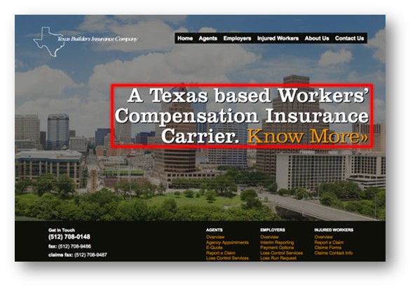
In this example of www.tbic.com, you see how there is a very large amount of “white space” (low proximity) around the major service offering, “A Texas based Workers Compensation Insurance Carrier.” While there is an image in the background, the lack of other visually complicated items has been purposely eliminated to create a strong compelling urge to read the sentence and act on the “Know More”. This is a great example of proximity (or lack thereof).
Things to Consider:
Proximity creates meaning
Elements that are alike should be grouped
Items that are different should be kept apart
The more spacing elements the clearer the difference
More spacing means LESS connection in elements
Clear separation makes navigating a website easier
Labels should be next to images they are naming or describing.
 In this example of www.tbic.com, you see how there is a very large amount of “white space” (low proximity) around the major service offering, “A Texas based Workers Compensation Insurance Carrier.” While there is an image in the background, the lack of other visually complicated items has been purposely eliminated to create a strong compelling urge to read the sentence and act on the “Know More”. This is a great example of proximity (or lack thereof).
Things to Consider:
Proximity creates meaning
Elements that are alike should be grouped
Items that are different should be kept apart
The more spacing elements the clearer the difference
More spacing means LESS connection in elements
Clear separation makes navigating a website easier
Labels should be next to images they are naming or describing.
In this example of www.tbic.com, you see how there is a very large amount of “white space” (low proximity) around the major service offering, “A Texas based Workers Compensation Insurance Carrier.” While there is an image in the background, the lack of other visually complicated items has been purposely eliminated to create a strong compelling urge to read the sentence and act on the “Know More”. This is a great example of proximity (or lack thereof).
Things to Consider:
Proximity creates meaning
Elements that are alike should be grouped
Items that are different should be kept apart
The more spacing elements the clearer the difference
More spacing means LESS connection in elements
Clear separation makes navigating a website easier
Labels should be next to images they are naming or describing.