Human Computer Interaction
HCI (Human Computer Interactions) is the concept of making computer programs and operating systems easy and usable for a wide range of humans to use. When people hear the term ‘HCI’, they always think that it just involves PCs. The fact is that HCI is spread across a much wider base than this. With new technology and devices constantly be released, it is becoming ever more important to ensure that the device can easily be used to its optimal potential. This is where HCI come in. Everyone experiences HCI when they use an ATM or even a TV remote. It goes quite far beyond choosing layouts, fonts and colours to make it understandable. Elements of human psychology are required to make it easier to use. For instance, instead of just putting up simple labels and colours to represent different options, the designers need to think about where the human mind would look for options and buttons.
Designers do not see humans as part of the way the system works, both the computer AND human are crucial to the way the computer works. They are symbiotic (they need each other to work). Without the human, a computer cannot be given orders to do things. Without the computer, humans don’t have the means to carry out their needs. Because designers do not think of the human as part of the way the computer operates, they do not often take human psychology into account when designing programs or operating systems.
HCI can be summed up with the 10 heuristic rules created by Jakob Neilson. These principles are broad guidelines for designing good interfaces. 4 examples of these heuristic rules are:
- Visibility of System status – The interface keeps the user informed on what it is doing or what is currently happening.
- Consistency and standards – Keeping systems similar to other interfaces to make them easy to understand. Users should not have to wonder if symbols or words things mean the same thing.
- Error prevention – Making sure that, instead of informing the user of an error, the error can be easily prevented in the first place.
- Aesthetic and Minimalist design – Keeping the design simple and minimalistic, not overcomplicating the system and also making relevant information easily visible.
The full list of heuristics can be seen at:
https://www.nngroup.com/articles/ten-usability-heuristics
The heuristic rules are used to measure how good an interface is. If it follows 8/10 of the heuristics or above, it can be counted as a good system. If does not follow many, then it is not very good. Good designers usually try to follow these rules so that their program or system will be used. If the system complies with all of the heuristics (which is very rare), then it is extremely good as an interface as it allows for easy and optimal use of the system. Jakob Neilson made the heuristics for designers to follow so that systems would become easier for human use.
I went around my house and found 3 interfaces that either comply with or go against a few heuristics.
First was my DVD player (Philips DVP3800 series). This interface complies with  several of the heuristic rules. It follows the rule of ‘Aesthetic and Minimalist design’ as it is not completely
covered in buttons and only has buttons for the basic functions of the DVD player. This means that a
human can easily use it without having to go through complicated procedures. It also follows the
‘Consistency and Standards’ rule as all of these buttons are the same as the ones on any other DVD player,
meaning that they are easy to understand. Another rule that it follows is the ‘Visibility of system status’
rule. It does this when it is actually in operation as icons appear at the top of the screen to show what
the DVD is doing (if it isn’t obvious already).
several of the heuristic rules. It follows the rule of ‘Aesthetic and Minimalist design’ as it is not completely
covered in buttons and only has buttons for the basic functions of the DVD player. This means that a
human can easily use it without having to go through complicated procedures. It also follows the
‘Consistency and Standards’ rule as all of these buttons are the same as the ones on any other DVD player,
meaning that they are easy to understand. Another rule that it follows is the ‘Visibility of system status’
rule. It does this when it is actually in operation as icons appear at the top of the screen to show what
the DVD is doing (if it isn’t obvious already).
The second interface I looked at was my microwave (Matsui 240TC series). This 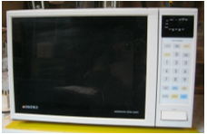 interface, again, follows ‘Aesthetic and Minimalist design’ but with the button pad only. While the
buttons are low in number and easy to read, the small black screen is covered in small and mostly
irrelevant and complicated writing. This means that someone using the microwave for the first time
would quite likely get confused by the small writing and its meaning. The buttons follow this heuristic
but the screen does not. When in operation, this interface follows ‘Visibility of system status’ as it
shows when the microwave is cooking by using a bright light inside the microwave as well as writing
saying that it is cooking on the screen. It also shows how much longer is has to cook for as all other
microwaves do.
interface, again, follows ‘Aesthetic and Minimalist design’ but with the button pad only. While the
buttons are low in number and easy to read, the small black screen is covered in small and mostly
irrelevant and complicated writing. This means that someone using the microwave for the first time
would quite likely get confused by the small writing and its meaning. The buttons follow this heuristic
but the screen does not. When in operation, this interface follows ‘Visibility of system status’ as it
shows when the microwave is cooking by using a bright light inside the microwave as well as writing
saying that it is cooking on the screen. It also shows how much longer is has to cook for as all other
microwaves do.
The last interface I studied at was my printer (Brother MFC-J5720DW series). This 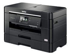 interface follows some heuristics but breaks one or two others. It is very good at following the ‘Visibility of
system status’ rule as it shows the user what its current action is when it is operational. It shows when it is
printing or doing any other action. It also follows the ‘User control and freedom’ rule as it allows a time
to exit before printing in case of error and also clearly marks the exit button with a glowing red ‘X’. This
is good as it means the user can exit without going through tiresome dialogue in the process. Finally, it
follows the ‘Error recognition and prevention’ rule as, when an error occurs such as a paper jam, it clearly
states what the problem is and how to fix it. This is good as it allows humans to continue to use it without
too much bother with errors. One heuristic that it breaks with the interface is ‘Aesthetic and Minimalist
design’. Although it starts off as minimalistic, it becomes very complicated further down the line when you
try to select the ‘Print’ option. There are too many other options and paths that are spaced too close together.
This makes them hard to read. They have also sacrificed clarity on the outer casing for further aesthetics.
They have left the casing clear of writing which makes it harder to find the USB ports (which are covered by
a flap) and, more importantly, the ink refill compartment. I remember, the first time I used it, it took me
longer than it should have to find where to replace the ink cartridges. So, in this instance… the outer design
is TOO simple while the interface itself get too complicated near the end.
interface follows some heuristics but breaks one or two others. It is very good at following the ‘Visibility of
system status’ rule as it shows the user what its current action is when it is operational. It shows when it is
printing or doing any other action. It also follows the ‘User control and freedom’ rule as it allows a time
to exit before printing in case of error and also clearly marks the exit button with a glowing red ‘X’. This
is good as it means the user can exit without going through tiresome dialogue in the process. Finally, it
follows the ‘Error recognition and prevention’ rule as, when an error occurs such as a paper jam, it clearly
states what the problem is and how to fix it. This is good as it allows humans to continue to use it without
too much bother with errors. One heuristic that it breaks with the interface is ‘Aesthetic and Minimalist
design’. Although it starts off as minimalistic, it becomes very complicated further down the line when you
try to select the ‘Print’ option. There are too many other options and paths that are spaced too close together.
This makes them hard to read. They have also sacrificed clarity on the outer casing for further aesthetics.
They have left the casing clear of writing which makes it harder to find the USB ports (which are covered by
a flap) and, more importantly, the ink refill compartment. I remember, the first time I used it, it took me
longer than it should have to find where to replace the ink cartridges. So, in this instance… the outer design
is TOO simple while the interface itself get too complicated near the end.
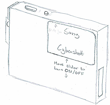
For my interface usability evaluation, I will be using a camera from my grandfather (Sony DSC-T7). It does not
have instructions so I will have to find out the purpose of each button on my own. The camera can be seen below.
Naturally, the camera is used for taking pictures and storing them.
 My task will therefore be to take a picture on the camera, view it and then delete it afterwards.
My first step was to turn the camera on. This camera is different as it does not use the traditional ‘On/Off’
button that most cameras use. Instead, it uses a mechanism where the front panel in front of the lens slides down
which automatically turns the camera on. Because there was no writing or notification to tell me to slide the panel,
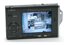 it took me a while to understand this and turn the camera on.
Taking the picture was a simple task. The only button that had to be pressed was the button on the top-right of the
camera, the same place where it is on most other cameras. There was one issue with the image not originally taking
as the button had to be held down and not just pressed.
When the picture was eventually taken, I had a bit of trouble using the interface to access the album of photos.
The icon that is usually used for this function
was not in the place that it is on other cameras. The button in its place only accessed the last picture when pressed.
Although this is what I originally wanted, it would not allow the user to delete the photo from this view. This was
frustrating as it only made my task more confusing.
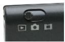 Eventually, I found the button to view and delete the album. It was a small slider in the top left-hand corner of
the camera as seen on the left. It only had symbols and no writing which I had earlier mistaken for different camera
modes (whether to take a photo or video).
Eventually, I found the button to view and delete the album. It was a small slider in the top left-hand corner of
the camera as seen on the left. It only had symbols and no writing which I had earlier mistaken for different camera
modes (whether to take a photo or video).
After I used the arrow keys to select the appropriate image, I had little trouble
 locating the delete button despite its small size and icon (It was a small button on the bottom of the camera with a dust
bin symbol next to it as seen on the right). After this button was pressed, it asked if I was sure I wanted to delete the
photo. After using the arrow keys to select the ‘Yes’ option, the image was deleted.
locating the delete button despite its small size and icon (It was a small button on the bottom of the camera with a dust
bin symbol next to it as seen on the right). After this button was pressed, it asked if I was sure I wanted to delete the
photo. After using the arrow keys to select the ‘Yes’ option, the image was deleted.
This camera complied with many of the heuristic rules. The fact that the ‘take picture’ button was in the same place
as it is on most other cameras, shows that it follows the ‘Consistency and standards’ rule. This is good as it means
that users without instructions such as myself can easily operate the basic function of the camera without doing
further research into the interface as its system is consistent with that of other cameras.
Another heuristic that the interface followed was ‘Aesthetic and minimalist design’. Because the system does not have
an excessive number of buttons on it, it means that the user does not have to search for too long or through too many
buttons to find the one they want. This allows for faster and more efficient use of the camera.
Yet another heuristic that was followed by the interface was ‘Error prevention’. Because the camera asked me if I was
sure I wanted to delete the image, it shows that it can stop a user from accidentally deleting a picture they wish to
keep. This would be a very useful feature in everyday life. This feature of the camera also follows the ‘User control
and freedom’ rule as it gives the user an ‘emergency exit’ option without extended dialogue.
The ‘Visibility of system status” rule was complied with as I noticed that icons appeared on the screen whenever an
action was taking place. When the flash was turned on, an icon appeared in the corner of the screen showing me that
the flash was active. Another example of this was when the photo album was loading. Instead of the screen going black
while it was loading, the camera instead had the word ‘Loading’ in the centre of the screen to indicate that this
action was taking place.
The ‘Match between system and real world’ rule was observed as it spoke the user’s (my) language. After exploring the
menu of the camera for a short time, I also found the capability to change the language setting of the camera. This
shows that this rule is definitely followed as people from many different countries would be able to operate the
camera properly after the camera language is changed.
One rule I would say that the camera did not follow was the ‘Help and documentation’ rule. This is because, as far as
I could see, there was no “Help” option on the camera which means that users that get confused without instruction
would have more difficulty operating the device. This would mean that it would take far longer for and inexperienced
user to work the interface if they can actually work it at all. A break from this rule was also shown by the absence
of notification on the outer shell of the camera. No small guidelines were given to move the slider down to turn the
camera on. Neither was there any verbal indication of the slider in the top left being from switching to the album.
All of these factors combined mean that the camera is generally harder for novice user or operate efficiently.
The other rules (‘Recognition rather than recall’, ‘Flexibility and efficiency of use’ and ‘Help user recognise,
diagnose and recover from errors’) were neither observed to be followed nor broken by this interface due to my situation
not requiring or showing them for the action I was performing.
‘Help user recognise, diagnose and recover from errors’ was not needed as, during the process of my investigation, no
errors took place to be diagnosed by the system.
Throughout my investigation, I came up with some improvements to the interface that would allow it to comply with the
heuristics it has broken. These fixes are simple and would make the system much easier to operate for novice users.
 With the front of the camera, there was not much to improve upon. The only thing that I altered was a label below the
slider to notify any user to move the slider down in order to turn the camera on and off.
With the front of the camera, there was not much to improve upon. The only thing that I altered was a label below the
slider to notify any user to move the slider down in order to turn the camera on and off.
This was only improvement needed on the front of the camera. Seeing as there was a lot of clear space on the front cover,
this change does not affect the ‘Aesthetic and minimalistic design’ heuristic but fixes part of the problem with clear
notification.
On the back, however, a few more changes were required. I shifted the ‘Menu’ button slightly further up to accommodate a new
‘Help’ button. This new button is designed to be a simple and easy route to a help screen so that novice user will easily be
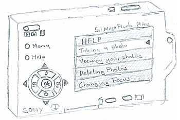 able to find help without an instruction manual.
My sketch on the screen shows an example of the Help screen. The option currently selected by the user is highlighted white
with a black arrow to make it extra obvious. By clicking the ‘OK’ button (which has been changed to have ‘OK’ written on it
for clarity), they can be taken to a page where simple-to-follow instruction would be provided for how to accomplish the
appropriate task. With this change, the interface now follows the ‘Help and documentation rule’. I also had an idea of the
user having the option to have a step-by-step help so that they do not have to read the help page and then remember it to
complete the task; the camera can just walk them through the process while they do it. This would allow the camera to clearly
follow the ‘Recognition rather than recall’ heuristic. With these alterations, the camera will now follow 3 more heuristic
rules and be much easier for novice users to operate efficiently.